
Risk Matrix Mastery in 2026: Expert Guide to Better Decision Making

Risk matrix tools play a vital role in today's volatile business world, where threats range from cybersecurity breaches to climate change effects. No one can completely eliminate risk, but knowing how to assess and prioritize potential threats leads to better decisions. A risk assessment matrix shows a quick visual snapshot of project risks and their severity that helps identify which problems need immediate action.
The system categorizes risks based on their likelihood and severity. A likely risk event carries a 61 to 90 percent chance of happening, and catastrophic impacts could lead to losses of $1M or more. A risk assessment table's structured approach helps with resource allocation and boosts accountability and transparency. A 5×5 risk assessment matrix can also reduce insurance costs. Companies that prepare for potential pitfalls handle them more successfully. This piece shows you how to use a risk matrix to turn uncertainty into manageable action items for better decision-making in 2026 and beyond.
Understanding the Risk Matrix Framework in 2026
Risk management has evolved substantially over the years. The risk matrix framework remains the life-blood tool for companies to guide them through uncertain times. This visual framework turns complex risk data into applicable information through structured review processes.
Understanding the Risk Matrix Framework in 2026
Definition of a Risk Assessment Matrix
A risk assessment matrix works as a visual tool to review and prioritize risks that could harm an organization [1]. This structured approach plots risks on two intersecting axes: one shows how likely a risk event might happen, while the other shows how severe its effects could be [2]. Each cell in the matrix shows a specific risk scenario with its risk level based on where likelihood and severity meet [1].
The risk assessment matrix helps organizations identify, review, and manage risks systematically. By sorting different risk levels (high and low), this tool helps decision-makers create action plans that guide them through uncertainty [1]. The matrix displays various risks as a chart, usually color-coded: high risks appear in red, moderate risks in yellow, and low risks in green [2].
Risk matrices prove valuable because they:
- Give a clear picture of risk priorities
- Let you review threats systematically
- Help allocate resources better
- Help teams talk about risks
- Turn gut feelings into measurable assessments
The simple formula to calculate risk levels is: Probability × Impact = Risk Level [3]
This calculation gives numbers that help sort risks by urgency. Most organizations use three levels to measure severity: High risk, Moderate/Medium risk, and Low risk [2]. Notwithstanding that, many organizations find more detailed approaches useful, especially with complex operations.
Difference Between Risk Matrix and Risk Heatmap
People often use these terms interchangeably, but risk matrices and risk heatmaps have subtle yet important differences [2]. Both tools show risks based on likelihood and impact, but they differ in how they work [2].
A risk matrix uses a grid with likelihood on one axis and consequence on the other. This lets you review risks through clear categories [2]. A risk heatmap flows more smoothly, plotting each risk based on exact likelihood and impact values instead of fixed categories [2].
This key difference changes how precise your risk assessment can be. Matrices use fixed categories, which might not be as precise as heatmaps [2]. The matrix format gives a more structured approach that many organizations find easier to use across departments.
Heat maps offer these benefits:
- More subtle risk positioning
- Smoother showing of risk severity
- Better display of how risks relate to each other
- Clearer patterns of risk clustering
Risk management experts say, "In the process of defining a Business Continuity Plan, carrying out a risk assessment is a priority... This is called the risk heat map or risk matrix" [2]. Both tools help organizations focus resources on their biggest threats.
Why the 5x5 Matrix Remains the Standard
The 5x5 risk matrix stays the top choice for most organizations in 2026, even though 3x3 or 4x4 versions exist [3]. Companies prefer it because it balances simplicity with detail - giving enough information without becoming too complex.
The 5x5 matrix offers five rating levels for both components (probability and impact), making risk analysis more accurate than simpler versions [3]. Probability ranges from "Rare" to "Almost Certain," while impact goes from "Insignificant" to "Severe" [1].
This structure creates 25 possible risk scenarios, offering much more detail than the 9 scenarios in a 3x3 matrix [2]. The 5x5 format brings these advantages:
- Makes risk levels easier to understand
- Cuts down time spent on number-heavy analyzes [3]
- Tells similar risks apart better
- Creates a standard way to compare risks across organizations
Risk assessment experts say the 5x5 matrix helps organizations spot which risks need immediate attention, working like "a to-do list for your worries" [1]. This helps companies use their limited resources wisely.
The 5x5 matrix uses numbers from 1 to 5 for each probability and impact category. Multiplying these numbers determines the risk level:
- 1-4: Acceptable – keep current controls [3]
- 5-9: Adequate – might need more analysis [3]
- 10-16: Tolerable – needs timely review and better strategies [3]
- 17-25: Unacceptable – needs immediate action and activity stoppage [3]
The 5x5 matrix leads the way in 2026 because it works well in companies of all sizes, from construction and healthcare to finance and technology [1]. Its simple visuals and meaningful risk sorting make it available to everyone in an organization, which encourages more people to practice risk management.
Companies that update their risk matrices quarterly or more often find this format handles new risks and changing priorities well [2]. This flexibility, plus its proven success in managing risks proactively, makes the 5x5 matrix the best choice for risk assessment frameworks in 2026 and beyond.
Key Components: Likelihood and Impact Explained
A risk matrix works on two basic axes: likelihood and impact. You need to understand these components in detail to make better risk assessments and decisions. Let's get into each component and see how they work together to create a complete risk evaluation tool.
Probability Scale: From Rare to Almost Certain
Likelihood shows how likely a risk event might happen within a specific timeframe. This axis splits probability into five clear levels. This gives us a way to measure uncertainties:
- Rare: These events have a minimal chance of occurring, typically less than 5% probability [2]. They might happen only in exceptional circumstances or not at all during a project's lifecycle.
- Unlikely: Events here have a low chance of occurring, usually between 5% to 20% [2]. These events aren't expected to happen during normal operations.
- Possible: These events have a moderate chance of happening, approximately 20% to 50% [2]. Regular monitoring is needed as the probability is high enough to watch closely.
- Likely: Events with a 50% to 80% probability fit here [2]. These risks will probably occur and need active management strategies.
- Almost Certain: With a probability over 80% [2], these events will almost surely happen. They need immediate attention and reliable prevention planning.
Some organizations use a 3×3 risk matrix with a simpler three-level scale: Unlikely (low chance), Likely (predicted to occur), and Highly Likely (almost guaranteed) [4]. The 5-level scale gives better precision in risk assessment.
Impact Scale: From Insignificant to Severe
The impact axis shows how severe the consequences could be if a risk happens. Like probability, impact has five categories:
- Insignificant: These events barely affect the project or organization [2]. They don't touch key objectives, timelines, or costs and are easy to handle.
- Minor: Risks with minor impacts cause some disruption but need only small fixes [2]. The project continues with slight changes to cost, schedule, or quality.
- Moderate (or Significant): These risks would have noticeable effects and might need big plan changes [2]. The project can finish, but substantial adjustments would be needed.
- Major (or Critical): Events at this level would seriously affect key objectives [2]. They could cause hospitalization, permanent partial disability, significant reversible environmental impact, or damage to equipment [3].
- Catastrophic (or Severe): The worst category includes risks that could cause project failure, extreme delays, budget problems, or serious safety incidents including death, permanent disability, significant irreversible environmental impact, or total equipment loss [3][2].
Organizations might use different names for these levels. Some say "Critical" instead of "Major" or "Marginal" instead of "Moderate," but they all go from minimal to severe impact [3][1].
Color Coding and Risk Categories
The matrix uses colors to show different risk categories, making it easy to understand at a glance:
- Green (Low Risk): These risks usually score between 1-4 [2] or 1-6 [4] depending on the organization. They need minimal attention, and keeping current control measures is enough.
- Yellow (Medium Risk): With scores typically between 8-10 [2], these risks need watching and maybe more analysis. They need some attention but aren't urgent.
- Orange (High Risk): Scoring around 12-16 [2], these risks need timely review and better strategies.
- Red (Very High/Extreme Risk): These risks score 20-25 [2] and need immediate action. They're "all hands on deck" situations that might need work to stop until safeguards are in place.
Risk scores come from a simple formula: probability score times impact score. In a 5×5 matrix, a "Likely" probability (4) with a "Major" impact (4) gives a risk score of 16, putting it in the high-risk (orange) category.
A complete risk matrix looks like this:
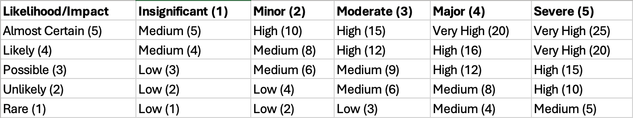
Multiple risk categories help spot wider business impacts and show the biggest risk areas [1]. This visual approach lets stakeholders quickly see which risks need immediate attention and which they can watch over time.
The color-coded system makes risk levels easy to understand. It cuts down the need for time-consuming number crunching while keeping enough detail to make good decisions. In fact, this visual approach turns gut feelings about risk into a standard framework that works across an organization.
Step-by-Step: How to Build a Risk Assessment Matrix
You need a structured approach to identify, analyze, and prioritize threats when creating a risk assessment matrix. Risk environments are becoming more complex, but building an effective risk matrix doesn't have to be complicated. Here's a practical four-step process to develop your own risk assessment matrix.
Step 1: Identify and Categorize Risks
You need a detailed picture of your total risk landscape. Start by collecting information from multiple sources to catch all possible threats [4]. Set up brainstorming sessions with key stakeholders across your organization to gather insights and create a basic list of risks [4]. This shared approach reduces the chance of missing valuable viewpoints, since people see risks differently [4].
Group your identified risks into these clear categories:
- Strategic Risks: Associated with failed business decisions
- Operational Risks: Related to breakdowns in internal processes
- Financial Risks: Linked to potential financial losses
- External Risks: Connected to uncontrollable sources [4]
Look at high-level risks tied to main business functions first, then zoom in on specific processes within those functions [4]. To name just one example, start with broad operational risks, then focus on specific areas like supplier management or resource limits [3]. Make sure to add industry-specific risks and new threats that thought leaders in your field have spotted [3].
This identification phase should use techniques like SWOT analysis (examining Strengths, Weaknesses, Opportunities, and Threats) and lessons from similar past projects [5]. Looking through documents and analyzing assumptions helps find hidden risks in project documentation [5].
Step 2: Define Likelihood and Impact Criteria
Set clear criteria to assess each risk before moving to evaluation. Risk matrices typically use two main intersecting criteria [4]:
- Likelihood: The probability the risk will occur (x-axis)
- Impact: How severe the consequences would be if the risk happens (y-axis) [4]
Everyone must agree on these criteria since they affect risk ratings and shape mitigation talks [4]. Create specific scales for both dimensions—usually using three levels (High/Medium/Low) or five points (1-5) where 1 means very low risk and 5 means very high risk [4].
Your likelihood scale should define each level clearly:
- Rare: May occur only in exceptional circumstances
- Unlikely: Could happen but not expected under normal operations
- Possible: Might occur at some time with reasonable chance
- Likely: Will probably occur in most circumstances
- Almost Certain: Expected to occur frequently [6]
Impact levels need clear definitions too:
- Insignificant: No injuries or minor inconvenience
- Minor: First aid required, slight disruption
- Moderate: Medical treatment needed, temporary work stoppage
- Major: Serious injury, significant operational impact
- Catastrophic: Fatality or permanent disability, major disruption [6]
Some organizations also look at vulnerability (how exposed they are) and velocity (how fast the risk could affect operations) [3].
Step 3: Assign Risk Scores and Ratings
Next, assess each risk based on your criteria. Do a qualitative risk analysis using your predefined scale [4]. Look at both likelihood and impact separately for each risk, then calculate a combined risk score.
Most people multiply the likelihood score by the impact score [7]. In a 5×5 matrix, a risk with likelihood 4 (Likely) and impact 3 (Moderate) gets a risk score of 12 [7].
Organizations usually group these scores into risk levels:
- Low risk (often green-coded, scores 1-4)
- Moderate/Medium risk (often yellow-coded, scores 5-9)
- High risk (often orange-coded, scores 10-16)
- Extreme risk (often red-coded, scores 17-25) [4]
Some organizations use "weighting" to customize their scoring—giving higher priority to risks in certain projects or departments [4]. Document your chosen method in risk management policies to keep things consistent [4].
Number each consequence and likelihood level to make it easier to assign scores and compare risks with similar ratings [1]. Risk scores give you a standard way to assess and talk about risk severity across departments.
Step 4: Plot Risks on the Matrix
Put each risk on your matrix grid after calculating risk scores. Place risks where their likelihood and impact ratings meet [3]. This visual tool shows which risks are high, medium, or low priority right away [3].
Most organizations use these colors to make things clear:
- Red: Extreme risks needing immediate action
- Orange: High risks needing timely review
- Yellow: Medium risks to monitor
- Green: Low risks needing minimal attention [8]
The finished matrix helps communicate risk priorities to everyone in the organization [4]. After plotting risks, create a plan that focuses on risks in high likelihood/high impact zones [4].
The risk landscape changes all the time, so update your risk assessment matrix regularly—at least yearly, but quarterly or ongoing updates work better [4]. Not updating your assessment might make you miss new risks that could disrupt business goals [4].
Note that a risk matrix works best as part of a bigger risk management system. The matrix doesn't eliminate risks—it helps you prioritize them and use resources wisely to reduce them.
How to Use a Risk Matrix for Better
A risk matrix becomes truly valuable when you use it for daily decisions. It works as a tool that helps teams communicate and make decisions by turning complex risk data into clear action steps.
Your risk scores guide the right responses. Most organizations create response tables that match actions to risk levels. A risk score of 20-25 signals extreme danger and might require stopping work until safety measures are in place [9]. Low-risk scores of 1-4 need basic monitoring [9].
Medium risks (5-9) need watching and possible fixes, while high risks (10-16) need quick review and better strategies [9]. This method makes sure you spend resources where they matter most.
Risk matrices do more than just sort problems. They let teams quickly spot which threats need attention first [4]. Modern businesses can't tackle every risk at once. Color codes help teams spot urgent issues fast.
The matrix helps create specific plans for different risk levels. Not every risk hits equally hard, so the matrix guides focused plans for bigger threats [4]. This difference matters in project management - a small workflow delay might not hurt much, but rising costs need careful planning.
Your risk matrix gives you a live picture of developing threats [4]. Regular updates help track new and returning risks. This keeps business running smoothly even when things get rocky.
Risk matrices bring several benefits to planning:
- Better visuals - They show complex risk data in clear pictures that everyone understands [2]
- Clear decisions - Everyone sees how choices are made [10]
- Smart resource use - Resources go where needed most [11]
- Better teamwork - Risk talks become easier at all company levels [2]
The best results come from making risk matrices part of your planning. They help balance both chance and effect quickly, showing how new safety steps change risk levels [10]. Some teams use two matrices - one for problems and one for opportunities. This gives decision makers the full picture [12].
Risk matrices have their limits. Sometimes higher ratings go to smaller risks, and very different risks might get the same score [13]. One real case showed a $46.79M risk rated worse than a $90.21M risk because of matrix design flaws [13].
Teams can fix these problems by making sure everyone understands risk definitions the same way. Good examples that fit different parts of the business help people rate risks consistently [14]. This shared understanding leads to better talks about risk and smarter choices across the company.
Your risk matrix stays useful with regular checkups. Good practice suggests checking every three months [15], though many now check constantly. These updates keep your risk management current with business goals and new threats. They turn unknown dangers into tasks you can handle.
References
[1] - https://www.agedcarequality.gov.au/sites/default/files/media/topic-resource-12-risk-matrix.pdf
[2] - https://www.iienstitu.com/en/blog/risk-matrix-a-comprehensive-guide-for-effective-decision-making
[3] - https://www.workiva.com/en-au/blog/building-risk-assessment-matrix
[4] - https://auditboard.com/blog/what-is-a-risk-assessment-matrix
[5] - https://www.pmi.org/learning/library/risk-identification-life-cycle-tools-7784
[7] - https://auditboard.com/blog/risk-management-101
[8] - https://www.piranirisk.com/blog/how-to-create-a-risk-assessment-matrix-step-by-step-guide
[9] - https://www.austrac.gov.au/business/core-guidance/amlctf-programs/implement-risk-management-process
[10] - https://pmc.ncbi.nlm.nih.gov/articles/PMC8851860/
[11] - https://cohesionco.com/blog/strategic-planning-and-risk-management/
[14] - https://www.trackernetworks.com/blog/risk-management-101-complete-2026-guide
[15] -https://www.standardfusion.com/blog/how-to-use-a-risk-assessment-matrix


.png)


.png)
.png)
.png)
.png)
.png)
.png)
.png)

.png)
.png)
.png)
.png)
.png)
.png)
.png)
.png)
.png)
.png)
.png)
.png)
.png)
.png)
.png)
.png)
.png)
.png)
.png)
.png)
.png)
.png)
.png)
.png)
.png)
.png)
.png)
.png)


.png)


Ready to Save Lives at Work?
With Impress Solutions, you’re not just getting a service, you’re securing peace of mind with a partner you can trust. Book a free consultation today, and let’s map out how we can help you save lives at work.